

The BaumStack Wednesday Edition: The Top 20 Greatest NBA Jerseys of All Time (Part 2 of 2)
The BaumStack Wednesday Edition: The Top 20 Greatest NBA Jerseys of All Time (Part 2 of 2)
This list is objective and unbiased so you're legally not allowed to argue with me about it

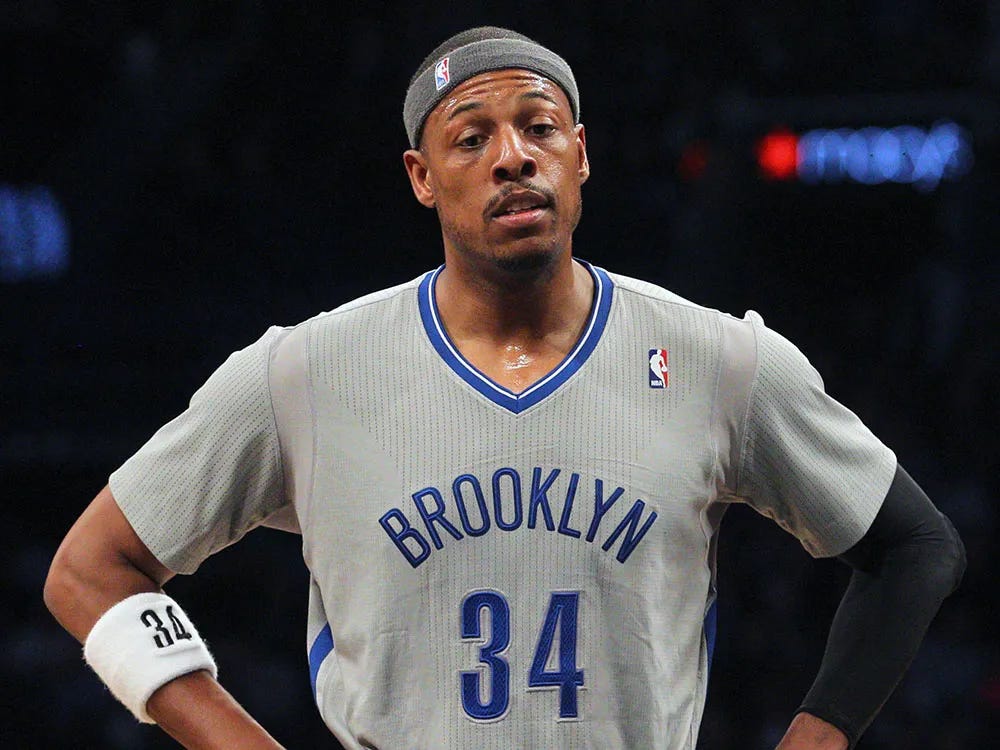
Okay, now, if you were following the instructions, you should’ve already read the last post because that was part one of a two-part deal here. That last part was the first half of a top 20 NBA jerseys of all time thing, and now here’s the top ten (you can access Part 1 here) (if that link doesn’t work it’s your fault). Surprisingly, those last ten contained a lot of new-er-ish looks, but luckily for everyone this list has a lot of more retro ones, which I think are a lot better than what we have nowadays. Before we begin, though, can we talk about the sleeved jerseys? Like those were weird, why did the NBA do that. Apparently Paul Pierce liked them, but I’m not sure why, I mean that Brooklyn one above looks horrible, like a middle school practice jersey. Just insane that the NBA greenlit any of the that. Okay now let’s talk about the cool ones.

10. Grizzlies (late-’90s away): My buddy Vav has a Mike Bibby Vancouver Grizzlies jersey, which is pretty random (considering he’s a Bulls fan and has never been to Vancouver), but I gotta admit it’s pretty clean. While I don’t want the Grizzlies to move back to Canada, I do want them to make these permanent, and bring back the giant bear clawing a basketball logo, that thing is sick, and it’s a heck of a lot cooler than their current branding. I love a bold light blue hue when it’s used right, and the trim on these jerseys goes insanely hard. This is where it’s at.
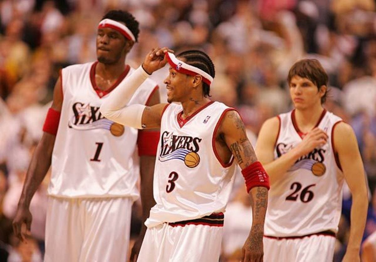
9. 76ers (early-2000s home): Oh man this is where we hit mainstream nostalgia. And I get it, everybody loves A.I., and the modern Sixers jerseys have been pretty basic. I mean, a lot of teams do variations of red, white, and blue, and here they decided to go a little cleaner with the home whites and a little bolder with the away blacks. While they might get knocked for being a little too simple, I think this is a great representation of how a jersey’s look can be elevated by the circumstances during which it was worn. Without The Answer rocking these in the early-aughts, it’s a good jersey, but with Iverson’s seal of approval, it’s a great jersey.
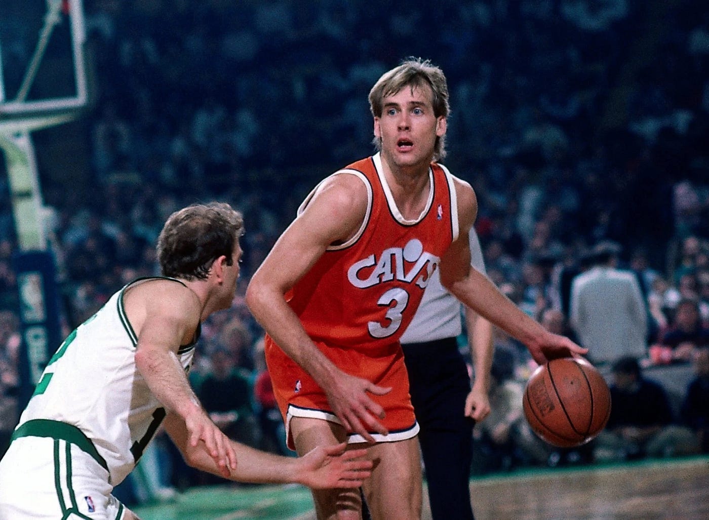
8. Cavaliers (late-’80s): I talked in the last post about how the late-’90s Raptors uniforms are maybe the most overrated jerseys of all time. On the flip side of that coin, the late-’80s Cavs uniforms might be the most underrated jerseys of all time. As I’ve said before, not a lot of teams utilize orange, and I think there’s a lot of opportunity on that front. Since these are jerseys from the 1980s, they’re extremely simple, but the white lettering is super clean, and it’s a far cry from some of the subdued, boring looks that teams roll out in current years under the guise of “minimalism”. This right here is how you give a minimal jersey design maximum quality.

7. Mavs (2022 City): The lettering here is so cool man. Also, yet another instance of a City jersey that should be a team’s main away jersey.

6. Warriors (2000s alternates): It’s another popular throwback, it’s another jersey that utilizes orange, and, maybe best of all, the lettering is awesome. Similar to the Sixers and Iverson, the first guy you think of when you think of these jerseys is Baron Davis, but unlike the Sixers and Iverson, I think these are still elite without the face of the franchise donning them. This might be controversial with how iconic the current uniforms are (as a result of Steph and Klay’s dynasty run), but these should be brought back as primary uniforms. I get that swapping out an established color scheme for a more unconventional one might be unpopular, but it’s clearly worth it.
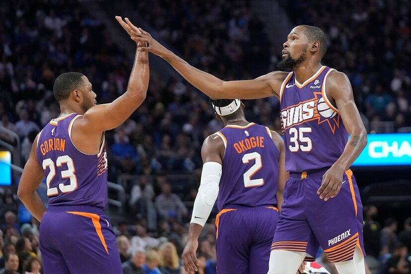
5. Suns (current away): I understand that this is another hot take, but that’s sort of the purpose behind this exercise, and I have some reasoning behind this. I love the Suns jerseys from years back, and these are able to combine multiple eras of uniforms into one look. It’s especially an improvement over their previous jerseys, which didn’t feature a logo (there’s nothing I hate more than cool logos or scripts getting left off of jerseys), and the purple and orange blend so well. Never change these.
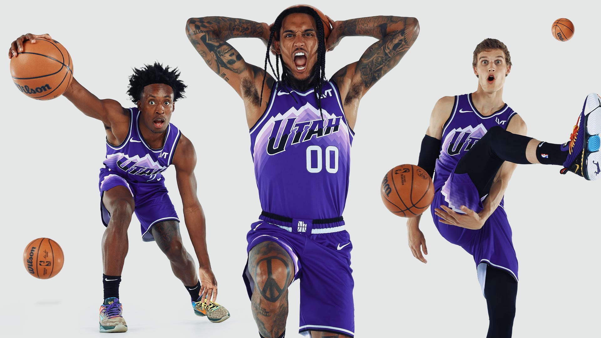
4. Jazz (current City): These are the NBA’s answer to the NHL’s “Reverse Retro” jerseys — vintage designs reworked into modern looks. Now, I like the original ‘90s jerseys better (more on that later), but the color scheme here is great, and details like the waistband bring this whole thing together. Wish my hometown Bulls would get their act together and make jerseys with this much swag.
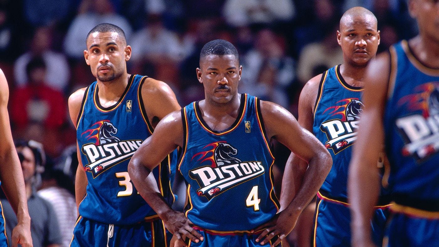
3. Pistons (early-2000s): Fire horse.
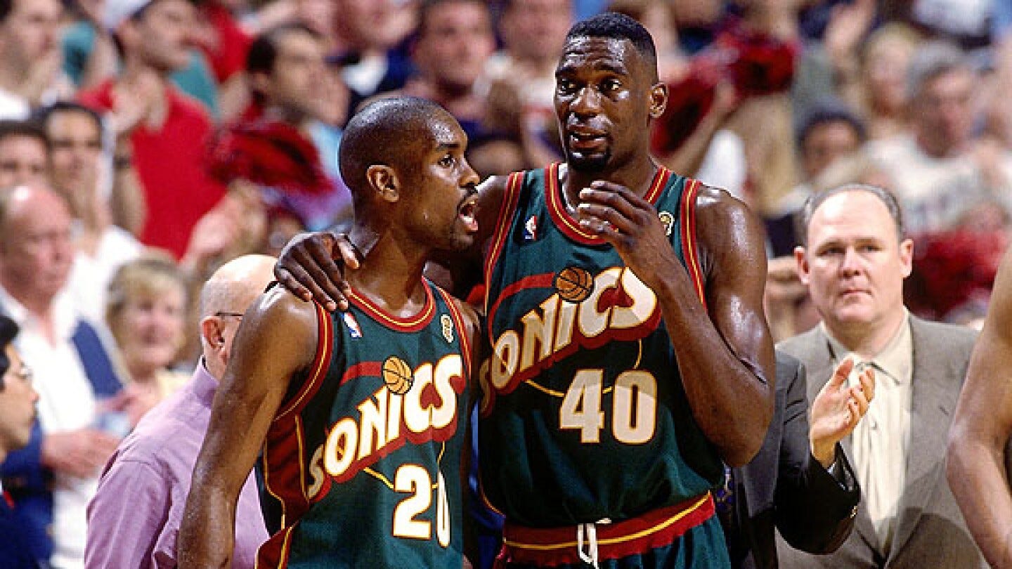
2. SuperSonics (late-’90s green & red): Okay I can’t find a good picture of the all-red ones they had as alternates, so you’ll just have to trust me on this one, but the late-’90s Sonics had the best one-two punch of away and alt jerseys of all time. Sure, some will say that the red, yellow, and green clash tremendously, and that the cartoonish SONICS lettering is stupid, but real ones know that this is the definition of taking a risk that pays dividends. Sure, it’s bold, but that’s why it works, and this is some of the coolest lettering in NBA history. Does it look like a Looney Tunes title screen? Sure, but it’s sick, and if it’s good enough for Shawn Kemp, it’s good enough for me.
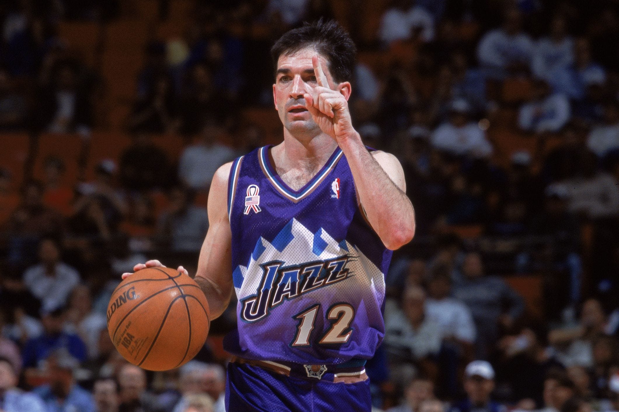
1. Jazz (late-’90s): This is the big one. The granddaddy of them all. This ain’t your dad’s jersey (actually it kinda is, but let’s pretend your dad is stupid and prefers today’s jerseys to those of yesteryear). This is the jersey donned by the greatest point guard of all time, the jersey worn by Michael Jordan’s biggest title threat, and the jersey with a mountain on it. It’s a nontraditional color (purple), the logo is set at the best size possible (oversized), and it radiates the essence of it’s time (the 1990s). This is the only basketball jersey I own (in this house we respect the GOAT John Stockton) (yes, I’m a Bulls fan, it’s weird, I get it, just let me enjoy the cool jersey), and I think it’s the standard that all jerseys should aspire to attain. We talked about the current Jazz City jerseys, which are based entirely off of these, but don’t quite go all the way. It’s the little things that set this one apart. While the new versions focus on color corrections and minimalism, the iconic fonts (for both the name and numbers) lose focus. It’s just so good man, I don’t know what else to say.
Anyways, that’s my ranking of the top 20 jerseys in NBA history. You can choose to disagree, that’s fine, but just know that if you do, you’re wrong and you suck. Maybe learn some ball. Also please share and subscribe and maybe buy a jersey that you think looks cool even if you don’t root for that team.
whole list is invalidated by the Bulls Pinstripe jersey. U R Foolish