

The BaumStack Wednesday Edition: The Top 20 Greatest NBA Jerseys of All Time (Part 1 of 2)
The BaumStack Wednesday Edition: The Top 20 Greatest NBA Jerseys of All Time (Part 1 of 2)
This list is objective and unbiased so you're legally not allowed to argue with me about it

Well, I guess I’m back now. Hopefully you guys missed me, but if not, I get it. My problem is if I forget to do one of these one week, then I keep forgetting to do one and next thing I know, it’s been months on end without any BaumStacks dropping. Less than ideal, I know. But hey, we’re back, and since I really don’t want to reflect on the Packers’ heartbreaking loss to the 49ers in the NFC Divisional or a Chicago Bulls squad that is somehow imploding and treading water at the same time, I’m gonna do something a little more light-hearted: NBA jersey rankings.
As far as fashion goes, I’m pretty boring and un-knowledgeable, as most of you guys have seen (either in person or via photos I put on Twitter every once in a blue moon). I mean, it’s pretty much just jeans and gray sweatshirts most of the winter and then cargo shorts and college-related t-shirts for most of the summer, and not much else. But I do love a good jersey, and I’ve noticed a depressing trend relating to NBA jerseys these past few years: over-saturation. Pro basketball has long had a storied tradition of striking uniforms, but efforts to bring in fresh ideas have largely produced bland designs that are pulled from shelves too quickly to make an impact. For a comparison, take a look at the other “Big Four” North American sports leagues: The NFL is largely sticking to the status quo, the NHL has embraced the past with their “Reverse Retro” sweaters, and the MLB has looked to the future with the “City Connect” line. Meanwhile, the NBA is constantly changing alternates in feeble attempts to make fashion statements. I mean, they’ve got Statement jerseys, City jerseys, jerseys for Christmas, jerseys for St. Patty’s day, they even got jerseys with sleeves on ‘em. And all of that’s in addition to the basic home/away unis that we expect to see. While it’s cool at first to have so many options, eventually the market starts getting watered down, and it’s even worse when 90% of the alternate jerseys lack inspiration and are only available to purchase during the season in which they’re used. In my mind, the NBA would do well to restrict every team to two alternate uniforms (in addition to their home/away ones) that don’t vary year-by-year, similar to how the NFL requires teams to have the same jersey lineup for at least five consecutive years. This could help preserve classic looks and get us out of this cycle of uninspired basketball fashion. Unfortunately for all of us, this won’t happen, because the people that actually run pro sports hate the common fan.
As a result of the pondering I’ve done on this subject, I decided to make a list of my personal favorite jerseys in NBA history. Is this list hypocritical at times? Yeah, I mean I just rambled on about NBA City jerseys being lame and I’ve got a good number of them on this list (granted, only one from this season makes the cut, and it’s mainly the City jerseys from the past 2-3 years that I really have a problem with). Is it really long? Yeah, I ranked twenty jerseys, which I didn’t think would be that much but apparently it is and I had to stretch this to two separate Substack posts (please read both it would make me really happy and all warm and fuzzy inside). But most of all, is this list correct?
Yeah.

20. Raptors (late-90s dinosaur): We’re gonna start this thing off with a hot take: This jersey is overrated. Now I get why, I mean it’s got a cartoon dinosaur on a purple background, Vince Carter and Tracy McGrady both wore these when they were in Toronto, the font is pretty unique, and did I mention it’s got a dinosaur playing basketball on it? It might be fatigue from how much I see this jersey get brought up in top ten lists, but I just don’t enjoy it as much as others from the ‘90s. Don’t get me wrong, it’s still a banger, it has every right to be on this list, and the Raptors should wear these instead of their current ones, but I don’t think it’s top ten.

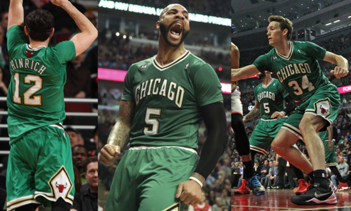
19. Bulls (2017 City): Yep, after all that rambling about City jerseys, we got our first City jersey. In my mind, this is what the City jerseys should’ve been: simple, clean looks that still are able to incorporate cultural elements from the places these teams call home. In this case, the colors of the Chicago city flag make up the palette while the Bulls away jerseys of the late ‘70s and early ‘80s make up the template, and it looks super clean. Subsequent Bulls City jerseys were either way too bright and distracting or way too simplistic and subdued, but this strikes the perfect balance of creativity and clarity.

18. Jazz (2017 City): Yep, another City jersey, and a controversial one at that. A lot of people hated on this jersey at the time because it looked like a third-grader made it, and while I understand the complaints, I think it works. While it’s super simple, it’s a neat homage to the local geography of Utah, and I think it’s got one of the best pairs of shorts in NBA jersey history. Hate all you want, I think it’s a cool look.
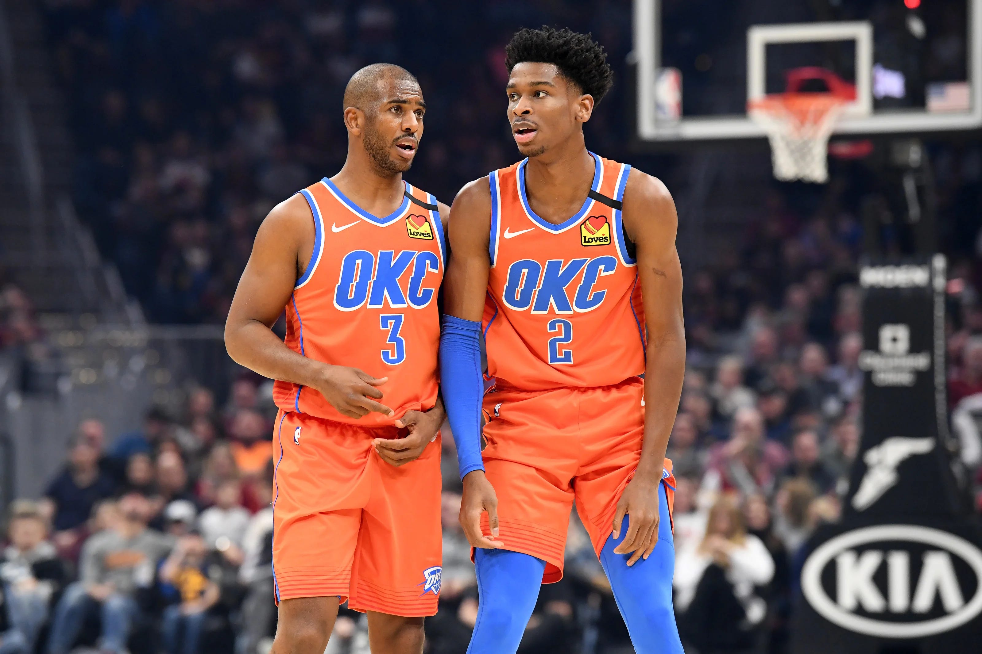
17. Thunder (2019 City): Okay I swear I’ll stop with the City jerseys, but this one should be the main away jerseys for the Thunder. I find their looks a lot more unique when they stress the orange as opposed to the blue (I mean I think it’s pretty obvious that there’s a lot more blue teams in the NBA than orange teams), and really the only tweak I would make is get rid of the glitch thing going on with the letters. Since it’s a City jersey, I’ll let that slide. Also, wearing blue sleeves with this jersey goes crazy.

16. Hawks (Wilkins-era): Okay now we’re getting into some classics. I’m not sure there’s a city that’s as connected to a jersey as Atlanta is to these Hawks ones. There’s a Jon Bois video were he creates MyPlayers in NBA 2k for members of the Atlanta rap scene, and he gives them these jerseys, so maybe that’s where I’m getting this from, but they’re also just really cool. There have been jerseys over the course of NBA history that have tried to pull off tilted numbers and letters, but I think these are really the only ones that have successfully done it. These jerseys make me wanna win an NBA dunk contest, or start playing small forward.

15. Hawks (late-90s): I prefer Atlanta’s bird to the Toronto’s dinosaur, looks a lot more intimidating if you ask me.

14. Heat (any Miami Vice): This was probably the best NBA marketing decision of the past decade. These looks perfectly encapsulated the essence of what a City jersey should be, and they were able to successfully tweak the original design for three straight years. Now, of course, they ruined it the next three years afterwards with uninspired looks, but this was peak team branding. If you’re really gonna make me pick one, I’m probably gonna go with the all-teal look, but you really can’t go wrong with any of these. Bold colors that don’t clash is the chef’s kiss of jersey design.
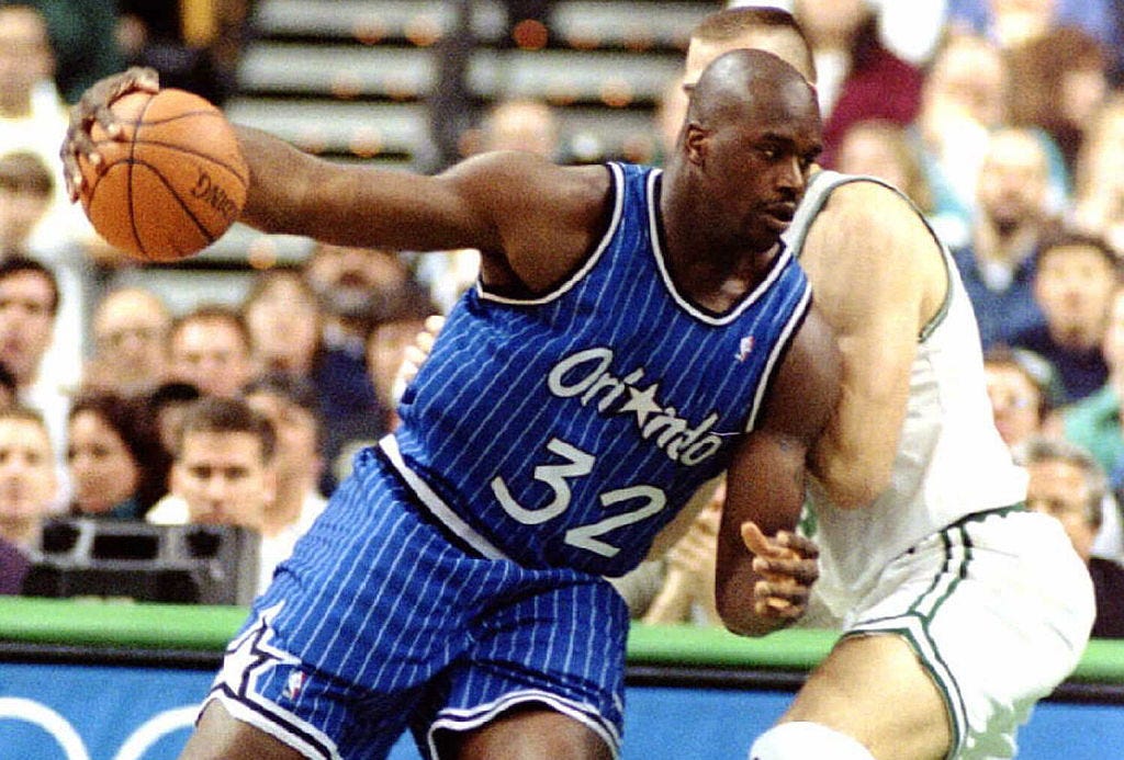
13. Magic (Shaq-era): I’m gonna focus on the blues here over some of their other options from the era, but this is how you make pinstripes work on a basketball jersey, and this is how you lean into the Disney-Orlando branding. The big star on the shorts is an added plus.

12. Trail Blazers (2017 Statement): I haven’t shown any love to the Statement jerseys yet, and that’s largely because most of them are unremarkable, but I love these. This is another instance where the alternate uniform should be the main away uniform. While it’s a pretty basic inversion of the Blazers’ main jerseys, I’m a big fan of red being the base color instead of their typical black or white. Additionally, the slash is a little bolder here than normal, which I think is kinda cool.

11. Rockets (early-2000s): I talked about pinstripes earlier with the ‘90s Magic, and while these are a little bolder, I think this is the next evolution in pinstripes. The cartoony rocket is pretty sick, and while you typically wouldn’t pinstripe a darker jersey, I think this works really well. It’s a shame Yao didn’t get to wear these for longer, and it’s even more of a shame that these were long gone by the time James Harden arrived in Houston.
Anyway yeah that’s part one, stay tuned for part two, I guess, idk.
Quick editor’s note: this is part one of a two-part post, please consider reading the second part, I mean after all that one’s got the better jerseys and more logical analysis, this one was pretty much just “what are some jerseys that I think are cool but maybe aren’t the coolest and have some room to grow” and works to set the stage for something bigger down the road. Also, thanks for reading, maybe share with some friends please that would be cool and make me feel important.
wish this had a dislike function cuase this list made me want to end my own life. Raptors at 20? Really? there's a reason why everyone loves it, because it is fucking awesome.
#18 can get sent into a dumpster fire